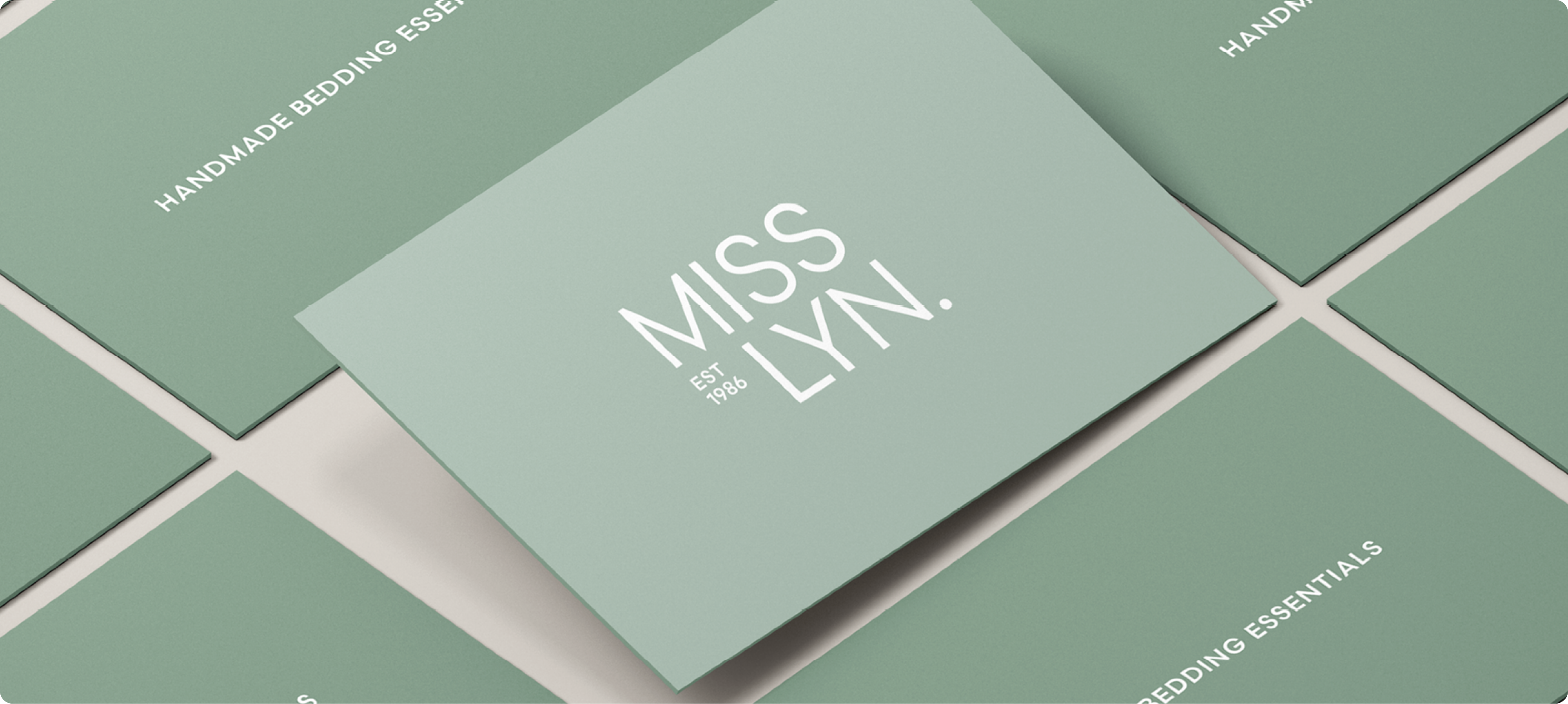
Miss Lyn
Brand Refresh
Redefining a fine linen brand for the new age and the new consumer.
.png)
.png)
The Brief
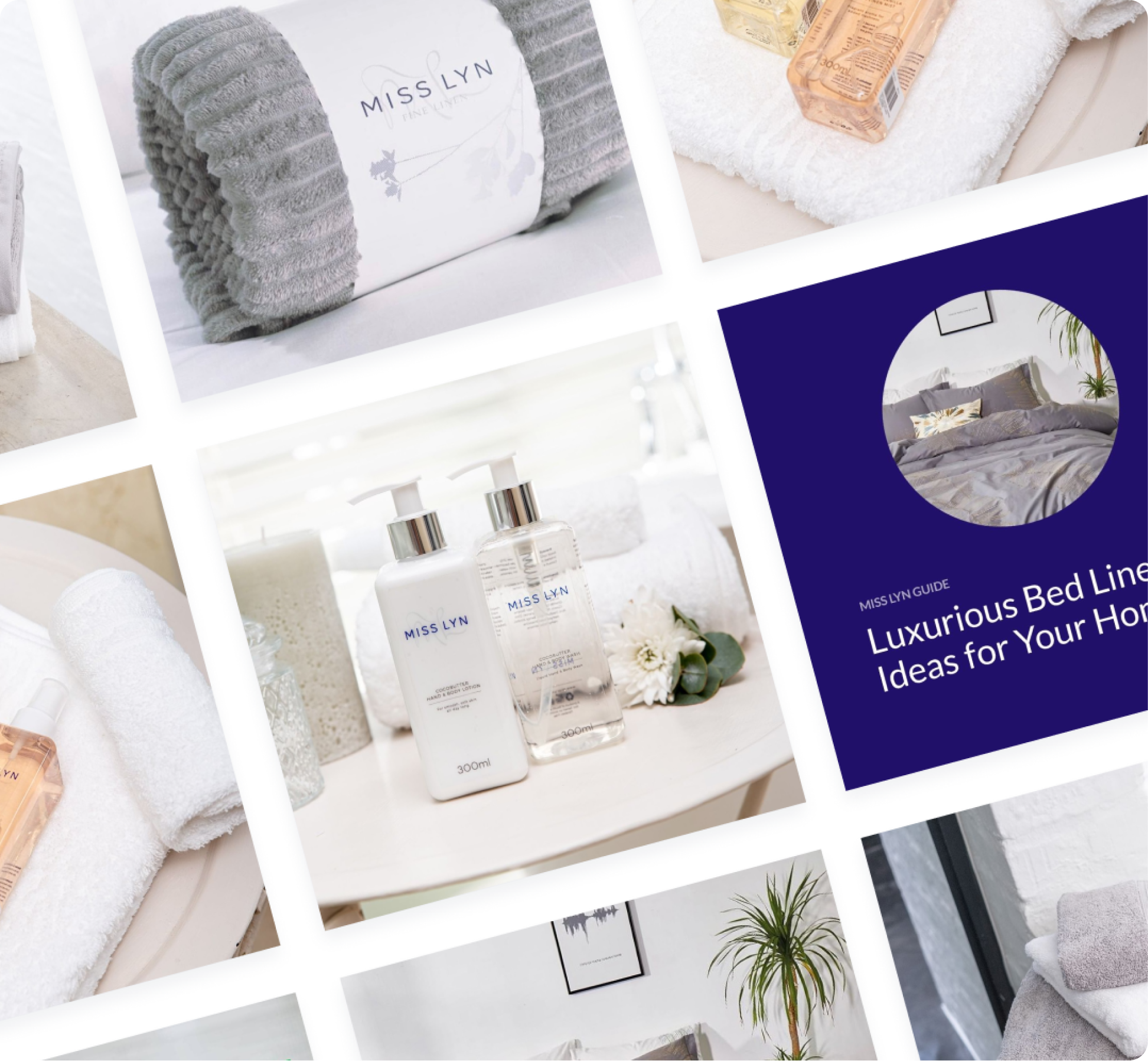
Started in 1986 by talented designer Lillian Currer, Miss Lyn was founded designing and manufacturing for some of the most prominent interior décor and baby stores nationally and globally. They are a destination linen shop selling 100% pure cotton bed linens, and more, in the wholesale and retail markets.
Having established itself over the last 40 years or so, the brand’s look had begun to show its age, and it was time for a new look and feel for the linen industry giant-slayer. They came to Platinum Seed for a rebrand (new logo and positioning) to set them up for another 40 years of growth, at least.
We focused on 2 things to breathe new life into the brand: where Miss Lyn is different and where it is the same as the competition. That’s where we could find our magic area – perfectly positioned to set ourselves apart while staying relevant to the audience.

We created a robust brand logo, able to conform to the multitude of executions this branding-heavy company needed. Complete with a logo-mark and iconic symbol, the execution of the visual aspect of the project is able to adapt to its surroundings while still always representing the brand.
When it comes to an all-new brand positioning, we updated the strapline as well as the tagline for the market positioning: Handmade Bedding Essentials and The Comfort of Quality, respectively. Both were strategically created to define the differences between Miss Lyn and the competition as well as the unique attributes within the industry.
.png)